R code to accompany Real-World Machine Learning (Chapter 6): Making Predictions
TweetAbstract
In the latest update to the rwml-R Github repo, R code is provided to complete the analysis of New York City taxi data from Chapter 6 of the book “Real-World Machine Learning” by Henrik Brink, Joseph W. Richards, and Mark Fetherolf. Examples given include exploratory data analysis with ggplot2 to identify and remove bad data; scaling numerical data to remove potential bias; development of machine learning models with caret; plotting of receiver operating characteristic (ROC) curves to evaluate model performance; and tabulation and display of feature importance using caret and gridExtra.
Data import and EDA for NYC taxi example
As mentioned in my previous post, the complete code-through for Chapter 6 includes examples of getting the data and performing exploratory data analysis (EDA).
Omitting bad data
A plot of the tip_amount data reveals a large number of rides that
result in no tip. Further analysis shows that these “no tip” rides are
associated with cash payers. In order to develop a model to predict
tipping behavior based on other factors, we must remove the data for
which payment_type == "CSH". This is done easily with the filter
function in dplyr. The remaining data is then plotted in a
histogram with ggplot2.
dataJoined <- dataJoined %>%
  filter(payment_type != "CSH")
p9 <- ggplot(dataJoined, aes(tip_amount)) +
  geom_histogram() +
  scale_x_continuous(limits = c(-1, 16.0), name = "Tip amount (USD)") +
  scale_y_continuous(name = "Count")
p9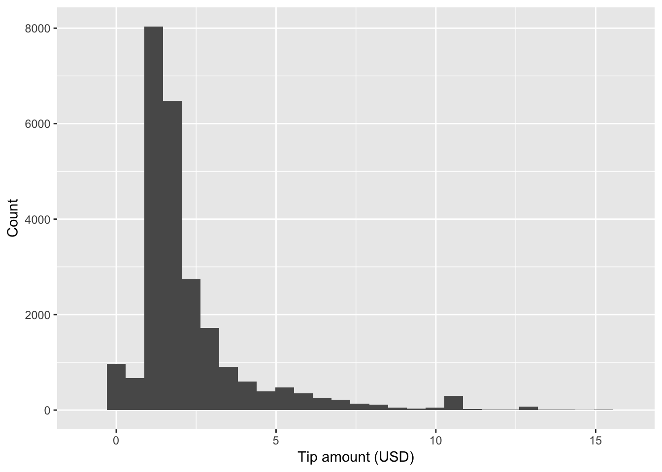
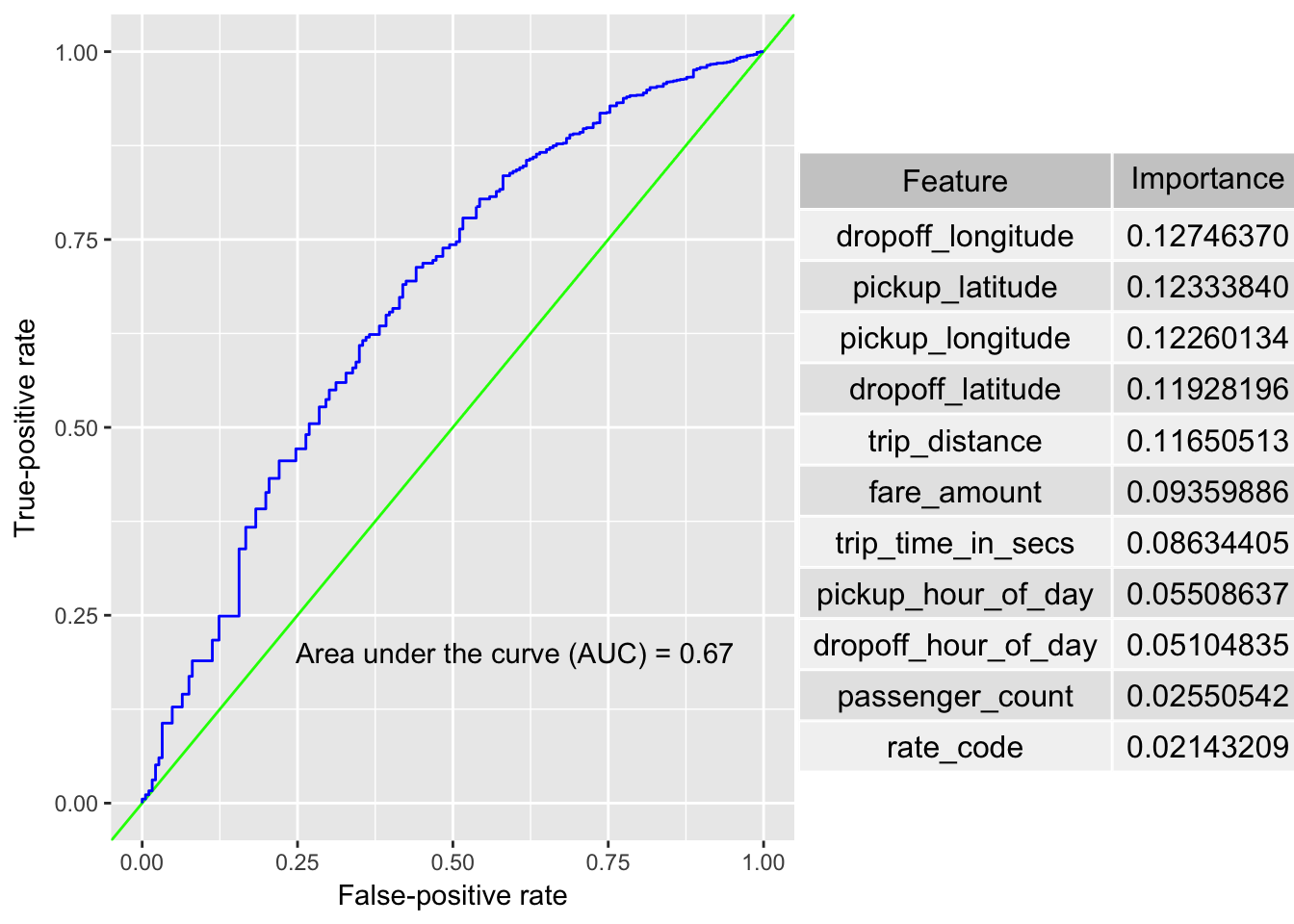
Model development and evaluation
After we have explored the data and identified the specific prediction that we would like to make (Will non-cash rides result in a tip?), we move onto model development. The effectiveness of the machine learning models are evaluated by plotting the ROC curves and computing the Area Under the Curve (AUC) using code developed for Chapter 4 (with slight modifications for our purposes here).
For each model, we follow our typical caret workflow of splitting the data
into training and test data sets with createDataPartition, setting up
control parameters with the trainControl function, training the model with
train, and making predictions with predict. The variable importance is
calculated with the varImp function of caret. We start with a simple
logistic regression model with the numerical data only. We then systematically
improve prediction results by moving to a random forest model, adding
categorical variables, and engineering date-time features. The final
ROC curve and table of variable importances are shown below.
Feedback welcome
If you have any feedback on the rwml-R project, please
leave a comment below or use the Tweet button.
As with any of my projects, feel free to fork the rwml-R repo
and submit a pull request if you wish to contribute.
For convenience, I’ve created a project page for rwml-R with
the generated HTML files from knitr, including a page with
all of the examples from chapter 6.