Multiple regression lines in ggpairs
TweetAbstract
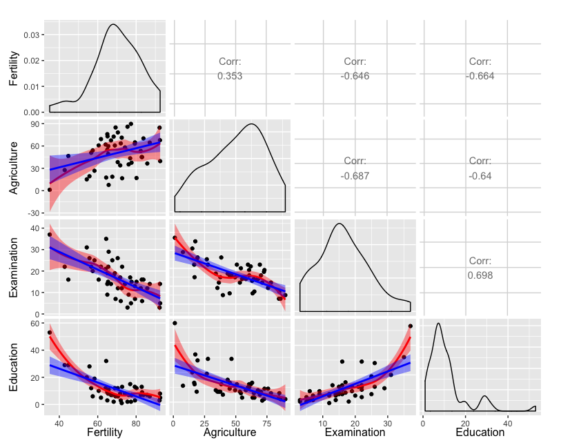
Plots including multiple regression lines are added to a matrix of plots generated with the GGally package in R.1
Background
Built upon ggplot2, GGally provides templates
for combining plots into a matrix through the ggpairs function.
Such a matrix of plots can be useful for quickly exploring the
relationships between multiple columns of data in a data frame.
The lower and upper arguments to the ggpairs function specifies
the type of plot or data in each position of the lower or upper diagonal
of the matrix, respectively.
For continuous X and Y data, one can specify the smooth option to
include a regression line.
To include more than one regression line in a plot (or to customize the
plot in any way beyond one of the predefined types), one simply
defines a function that returns the desired plot.
The function can then be included in the list provided to upper or
lower.
The code
The following code demonstrates inclusion of two regression lines in each plot in the lower diagonal elements in which both X and Y data are continuous.
The plot
The plot generated by the above code is included here. Note that the default transparency of the confidence interval works fairly well for being able to compare the two types of regression curves.
-
Credit to an excellent answer on Stack Overflow. ↩